Why mgcv is awesome
1 Why mgcv is awesome

Don’t think about it too hard… 😉
This post looks at why building Generalized Additive Model, using the mgcv package is a great option. To do this, we need to look, first, at linear regression and see why it might not be the best option in some cases. I’m using simulated data for all plots, but I’ve hidden the first few code chunks to aid the flow of the post. If you want to see them, you can get the code from the page on my GitHub repository here.
2 Regression models
Let’s say we have some data with two attributes, \(Y\) and \(X\). If they are linearly related, they might look something like this:
library(ggplot2)

a<-ggplot(my_data, aes(x=X,y=Y))+
  geom_point()+
  scale_x_continuous(limits=c(0,5))+
  scale_y_continuous(breaks=seq(2,10,2))+
  theme(axis.title.y = element_text(vjust = 0.5,angle=0))

a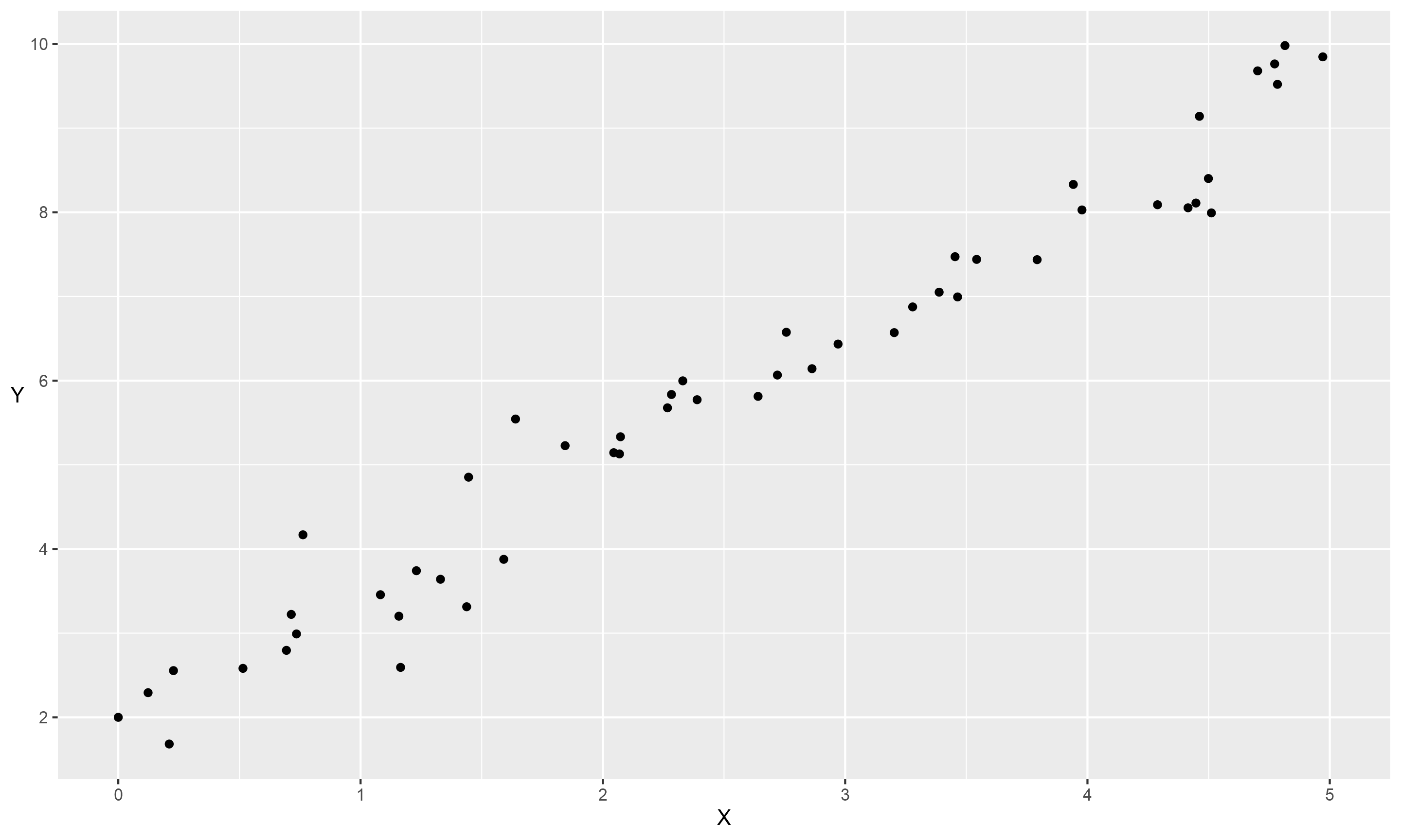
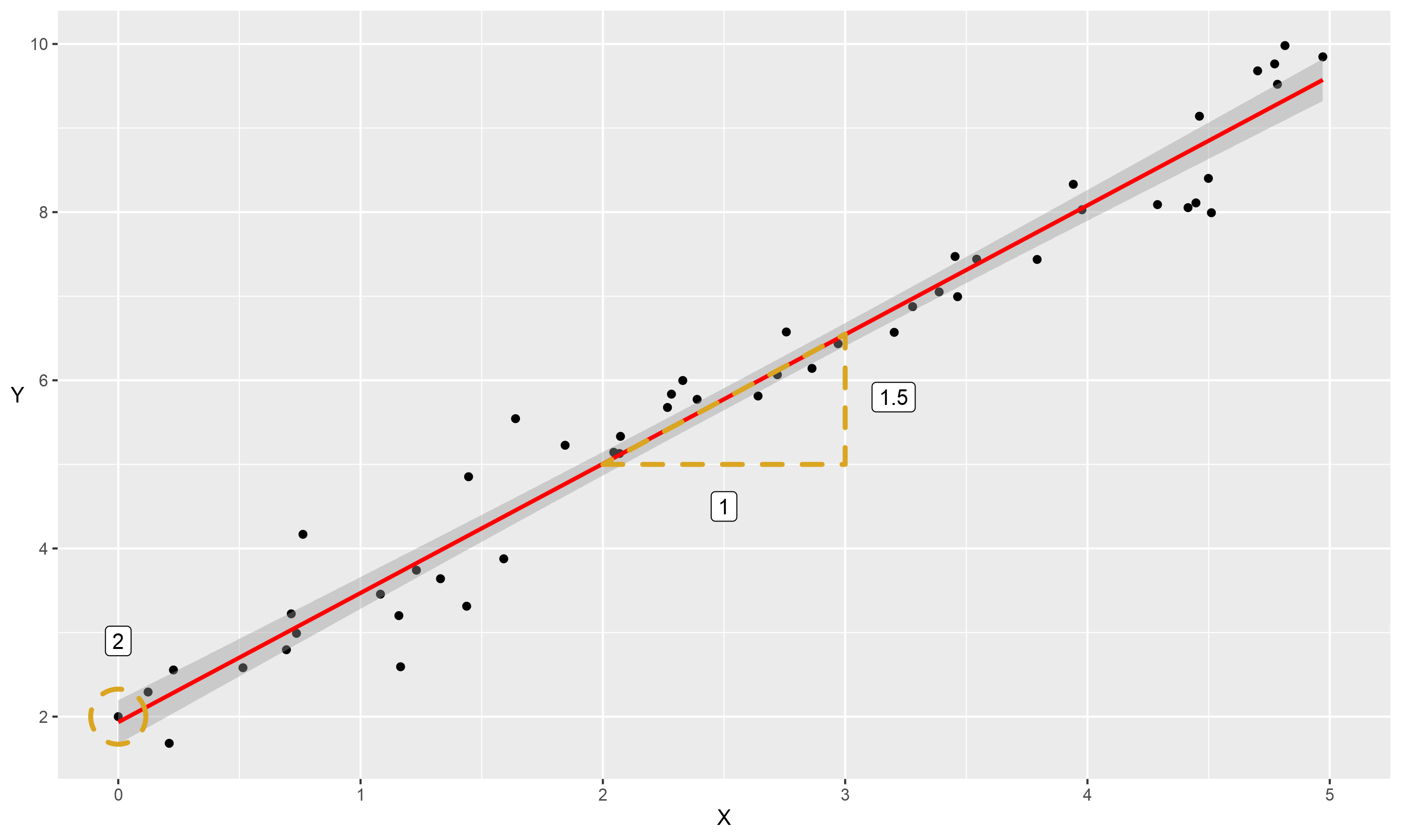
To examine this relationship we could use a regression model. Linear regression is a method for predicting a variable, \(Y\), using another, \(X\). Applying this to our data would predict a set of values that form the red line:
library(ggforce)
a+geom_smooth(col="red", method="lm")+
  geom_polygon(aes(x=X, y=Y), col="goldenrod", fill=NA, linetype="dashed", size=1.2, data=dt2)+
  geom_label(aes(x=X, y = Y, label=label), data=triangle)+
  geom_mark_circle(aes(x=0, y=2), col="goldenrod",  fill=NA, linetype="dashed", size=1.2)+
  theme(axis.title.y = element_text(vjust = 0.5,angle=0))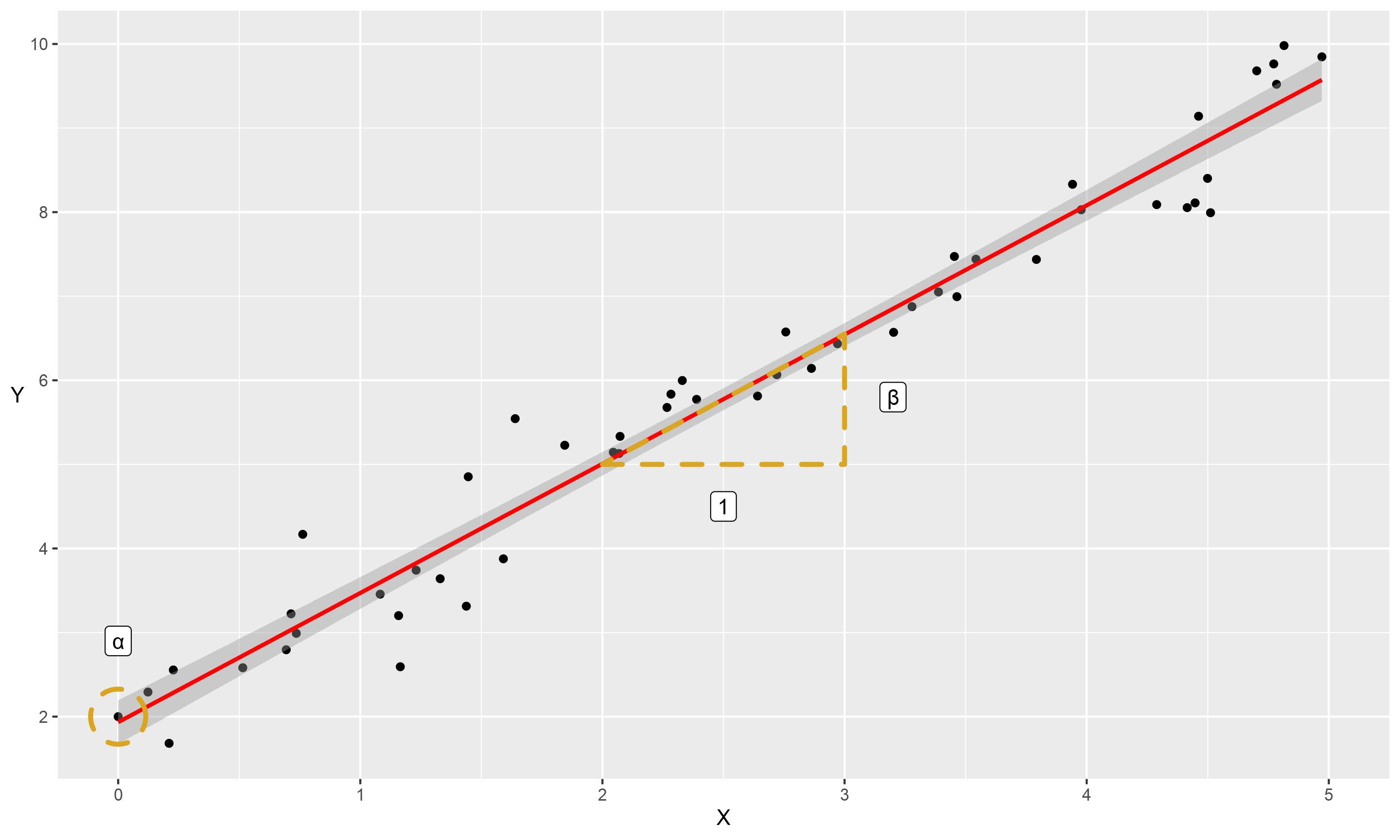
This might bring back school maths memories for some, but it is the ‘equation of a straight line’. According to this equation, we can describe a straight line from the position it starts on the \(y\) axis (the ‘intercept’, or \(\alpha\)), and how much \(y\) increases for each unit of \(x\) (the ‘slope’, which we will also call the coefficient of \(x\), or \(\beta\)). There is also a some natural fluctuation, as all points would be perfectly in-line if not. We refer to this as the ‘residual error’ (\(\epsilon\)). Phrased mathematically, that is:
\[y= \alpha + \beta x + \epsilon\]
Or if we substitute the actual figures in, we get the following:
\[y= 2 + 1.5 x + \epsilon\]
This post won’t go into the mechanics of estimating these models in any depth, but we estimate the models by taking the difference between each data point and the line (the ‘residual’ error), then minimising this difference. We have both positive and negative errors, above and below the line, so to make them all positive for estimation by squaring them and minimising the ‘sum of the squares.’ You may hear this referred to as ‘ordinary least squares’, or OLS.
3 What about nonlinear relationships?
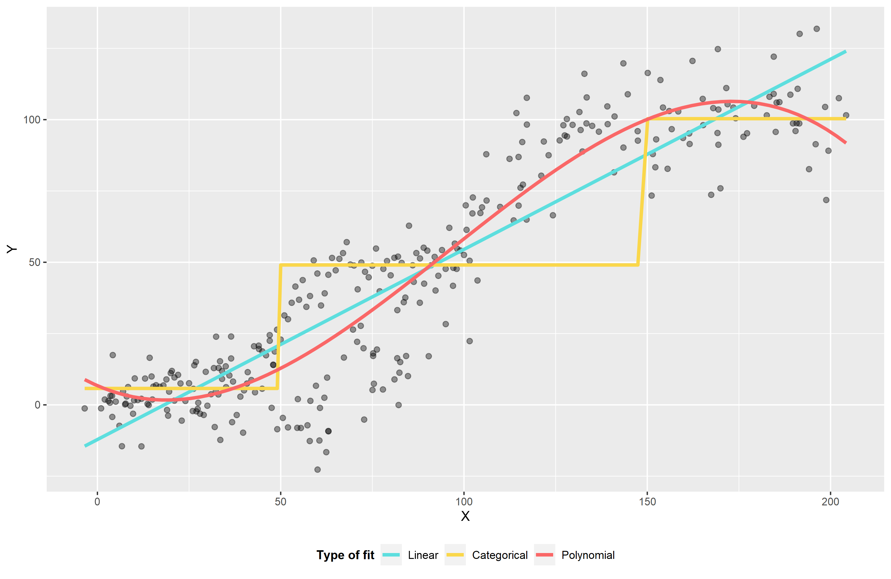
So what do we do if our data look more like this:
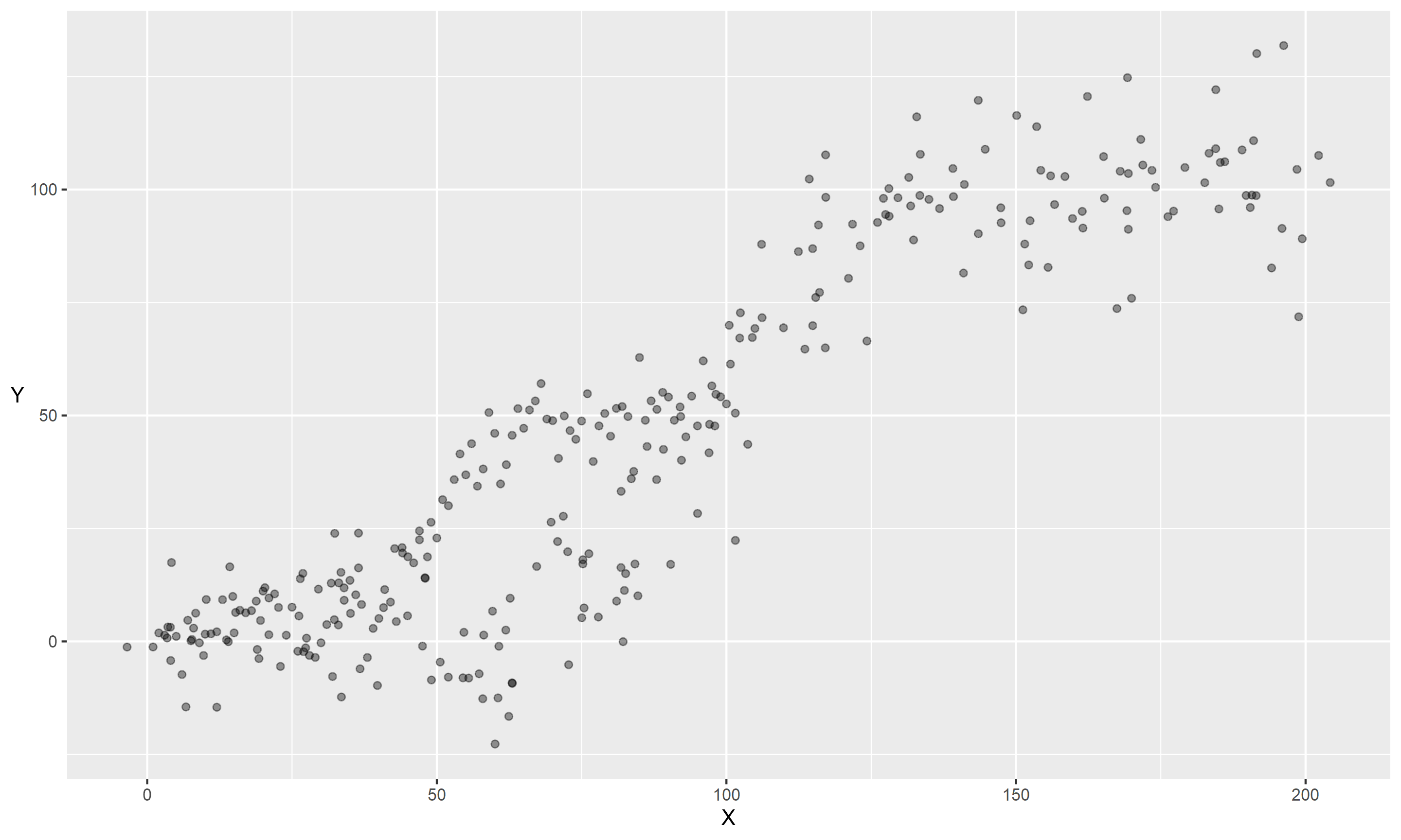
One of the key assumptions of the model we’ve just seen is that \(y\) and \(x\) are linearly related. If our \(y\) is not normally distributed, we use a Generalized Linear Model (Nelder & Wedderburn, 1972), where \(y\) is transformed through a link-function, but again we are assuming \(f(y)\) and \(x\) are linearly related. If this is not the case, and the relationship varies across the range of \(x\), it may not be the best fit. We have a few options here:
- We can use a linear fit, but we will under or over score sections of the data if we do that.
- We can divide into categories. I’ve used three in the plot below, and that is a reasonable option, but it’s a bit or a ‘broad brush stroke.’ Again we may be under or over score sections, plus is seems inequitable around the boundaries between categories. e.g. is \(y\) that much different if \(x=49\) when compared to \(x=50\)?
- We can use transformation such as polynomials. Below I’ve used a cubic polynomial, so the model fits: \(y = x + x^2 + x^3\). The combination of these allow the functions to smoothly approximate changes. This is a good option, but can oscillate at the extremes and may induce correlations in the data that degrade the fit.
4 Splines
A further refinement of polynomials is to fit ‘piece-wise’ polynomials, where we chain polynomials together across the range of the data to describe the shape. ‘Splines’ are piece-wise polynomials, named after the tools draftsmen used to use to draw curves. Physical splines were flexible strips that could bent to shape and were held in place by weights. When constructing mathematical splines, we have polynomial functions (the flexible strip), continuous up to and including second derivative (for those of you who know what that means), fixed together at ‘knot’ points.
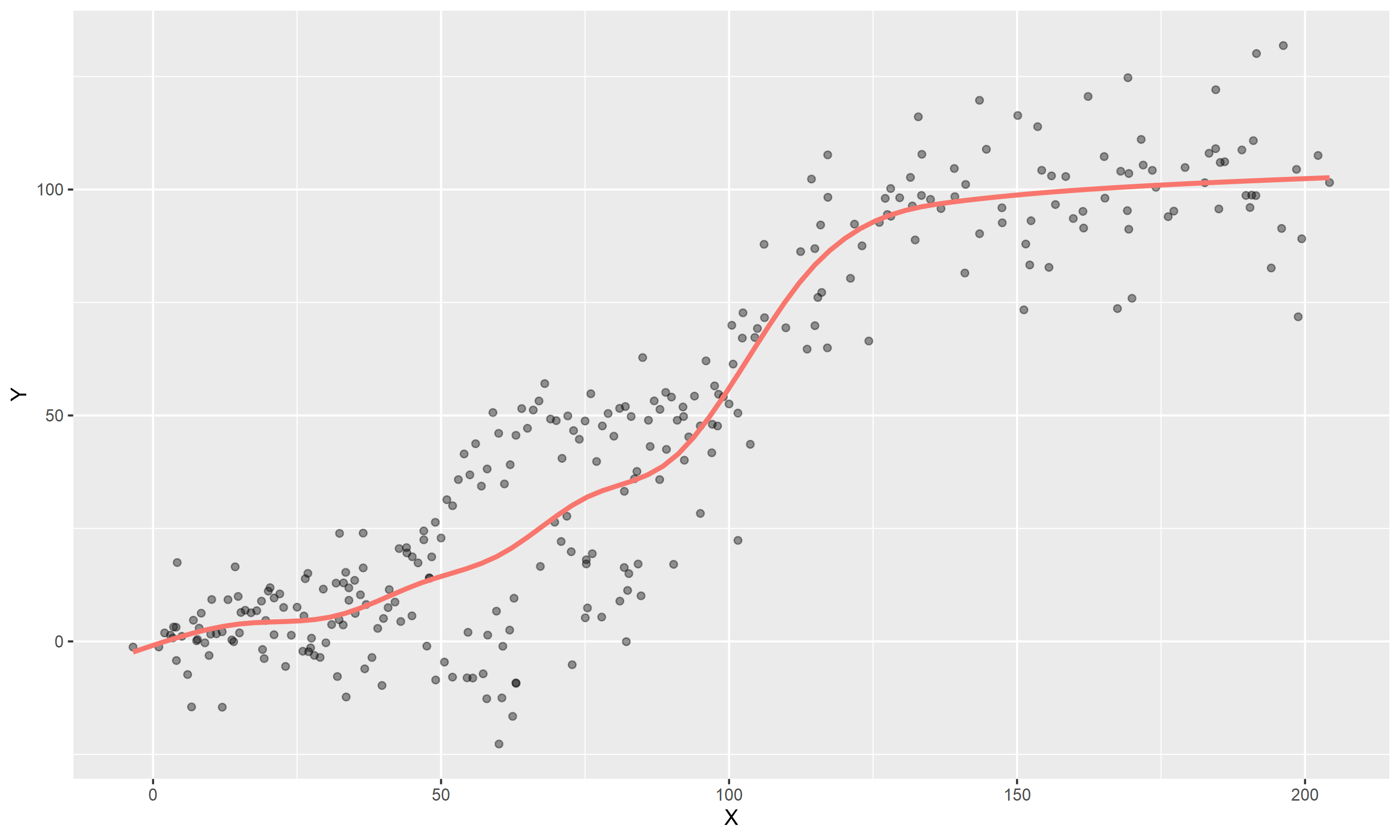
Below is a ggplot2 object with a geom_smooth line with a formula containing a ‘natural cubic spline’ from the ns function. This type of spline is ‘cubic’ (\(x+x^2+x^3\)) and linear past the outer knot points (‘natural’), and it is using 10 knots
5 How smooth is smooth?
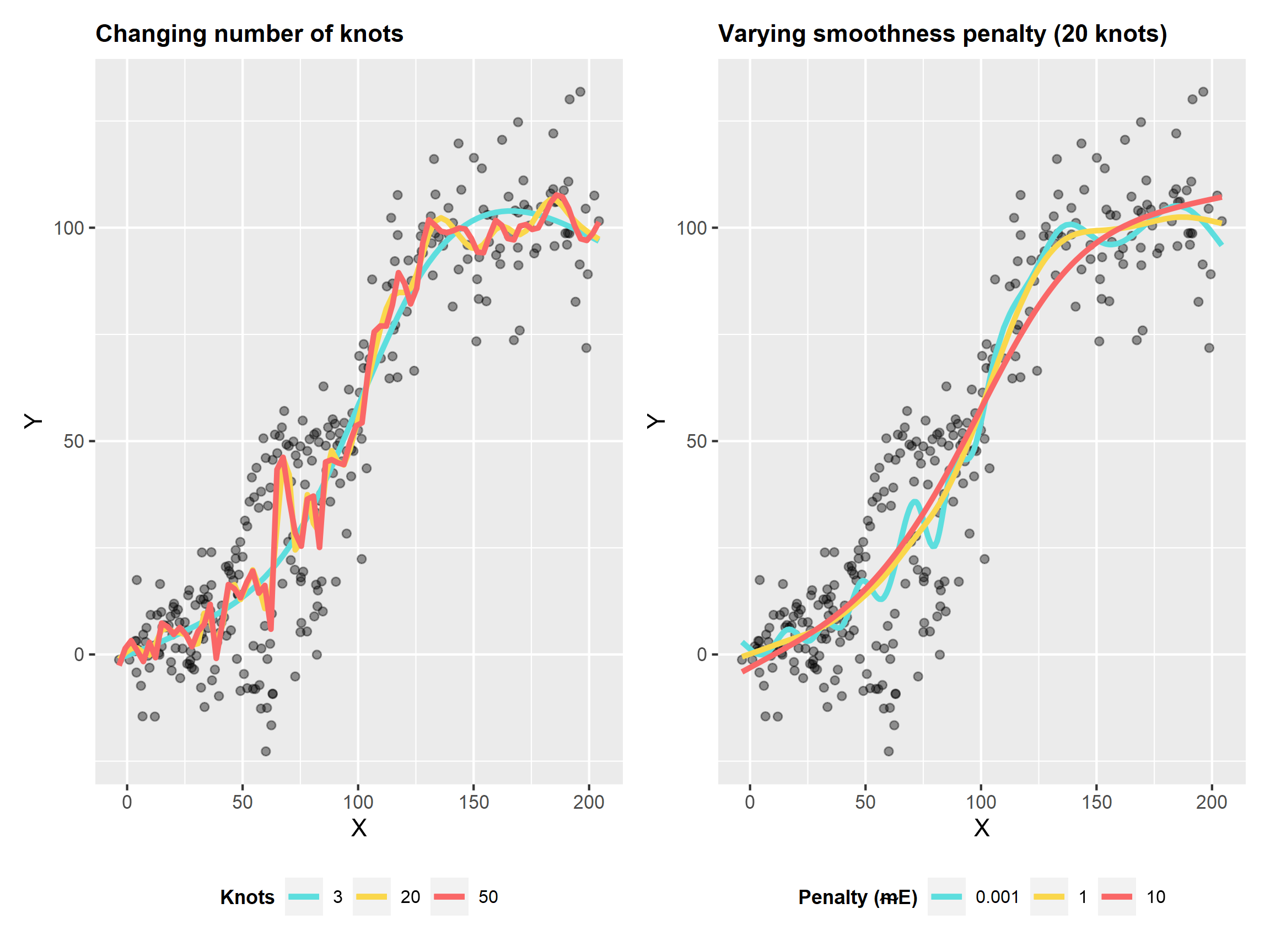
The splines can be a smooth or ‘wiggly’ as you like, and this can be controlled either by altering the number of knots \((k)\), or by using a smoothing penalty \(\gamma\). If we increase the number of knots, it will be more ‘wiggly’. This is likely to be closer to the data, and the error will be less, but we are starting to ‘over-fit’ the relationship and fit the noise in our data. When we combine the smoothing penalty, we penalize the complexity in the model and this helps reduce the over-fitting.
6 Generalized Additive Models (GAMs)
A Generalized Additive Model (GAM) (Hastie, 1984) uses smooth functions (like splines) for the predictors in a regression model. These models are strictly additive, meaning we can’t use interaction terms like a normal regression, but we could achieve the same thing by reparametrising as a smoother. This is not quite the case, but essentially we are moving to a model like:
\[y= \alpha + f(x) + \epsilon\]
A more formal example of a GAM, taken from Wood (2017), is:
\[g(\mu i) = A_i \theta + f_1(x_1) + f_2(x_{2i}) + f3(x_{3i}, x_{4i}) + ...\]
Where:
\(\mu i \equiv E(Y _i)\), the expectation of Y
\(Yi \sim EF(\mu _i, \phi _i)\), \(Yi\) is a response variable, distributed according to exponential family distribution with mean \(\mu _i\) and shape parameter \(\phi\).
\(A_i\) is a row of the model matrix for any strictly parametric model components with \(\theta\) the corresponding parameter vector.
\(f_i\) are smooth functions of the covariates, \(xk\), where \(k\) is each function basis.
6.1 So what does that mean for me?
In cases where you would build a regression model, but you suspect a smooth fit would do a better job, GAM are a great option. They are suited to non-linear, or noisy data, and you can use ‘random effects’ as they can be viewed as a type of smoother, or all smooths can be reparameterised as random effects. In a similar fashion, they can be viewed as either Frequentist random effects models, or as Bayesian models where the smoother is essentially your prior (don’t quote me on that, I know very little about Bayesian methods at this point).
There are two major implementations in R:
Trevor Hastie’s
gampackage, that uses loess smoothers or smoothing splines at every point.Simon Wood’s
mgcvpackage, that uses reduced-rank smoothers, and is the subject of this post.
There are many other further advances on these approaches, such as GAMLSS, but they are beyond the scope of this post.
7 mgcv: mixed gam computation vehicle
Prof. Simon Wood’s package (Wood,2017) is pretty much the standard. It is included in the standard distribution of R from the R project, and included in other packages such as in geom_smooth from ggplot2. I described it above as using ‘reduced-rank’ smoothers. By this, I mean that we don’t fit a smoother to every point. If our data has 100 points, but could be adequately described by a smoother with 10 knots, it could be described as wasteful to require more. This also hits our degrees-of-freedom and can affect our tendency to over fit. When we combine enough knots to adequately describe our data’s relationship, we can use the penalty to hone this to the desired shape. This is a nice safety net, as the number of knots is not critical past the minimum number.
mgcv not only offers the mechanism to build the models and smoothers, but it will also automatically estimate the penalty values for you and optimize the smoothers. When you are more familiar with it, you can change these settings, but it does a very good job out of the box. In my own PhD work, I was building models based on overdispersed data, where there was more error/noise in the data than expected. mgcv was great at cutting through this noise, but I had to increase the penalty values to compensate for this noise.
So how do you specify an mgcv GAM for the sigmoidal data above? Here I will use a cubic regression spline in mgcv:
library(mgcv)
my_gam <- gam(Y ~ s(X, bs="cr"), data=dt)
The settings above mean:
s()specifies a smoother. There are other options, butsis a good defaultbs="cr"is telling it to use a cubic regression spline (‘basis’). Again there are other options, and the default is a ‘thin-plate regression spline’, which is a little more complicated than the one above, so I stuck withcr.The
sfunction works out a default number of knots to use, but you can alter this withk=10for 10 knots for example.
8 Model Output:
So if we look at our model summary, as we would do with a regression model, we’ll see a few things:
summary(my_gam)##
## Family: gaussian
## Link function: identity
##
## Formula:
## Y ~ s(X, bs = "cr")
##
## Parametric coefficients:
## Estimate Std. Error t value Pr(>|t|)
## (Intercept) 43.9659 0.8305 52.94 <2e-16 ***
## ---
## Signif. codes: 0 '***' 0.001 '**' 0.01 '*' 0.05 '.' 0.1 ' ' 1
##
## Approximate significance of smooth terms:
## edf Ref.df F p-value
## s(X) 6.087 7.143 296.3 <2e-16 ***
## ---
## Signif. codes: 0 '***' 0.001 '**' 0.01 '*' 0.05 '.' 0.1 ' ' 1
##
## R-sq.(adj) = 0.876 Deviance explained = 87.9%
## GCV = 211.94 Scale est. = 206.93 n = 300- Model coefficients for our intercept is shown, and any non-smoothed parameters will show here
- An overall significance of each smooth term is below.
- Degrees of freedom look unusual, as we have decimal. This is based on ‘effective degrees of freedom’ (edf), because we are using spline functions that expand into many parameters, but we are also penalising them and reducing their effect. We have to estimate our degrees of freedom rather than count predictors (Hastie et al., 2009) .
9 Check your model:
The gam.check() function can be used to look at the residual plots, but it also test the smoothers to see if there are enough knots to describe the data. Read the details below, or the help file, but if the p-value is very low, you need more knots.
gam.check(my_gam)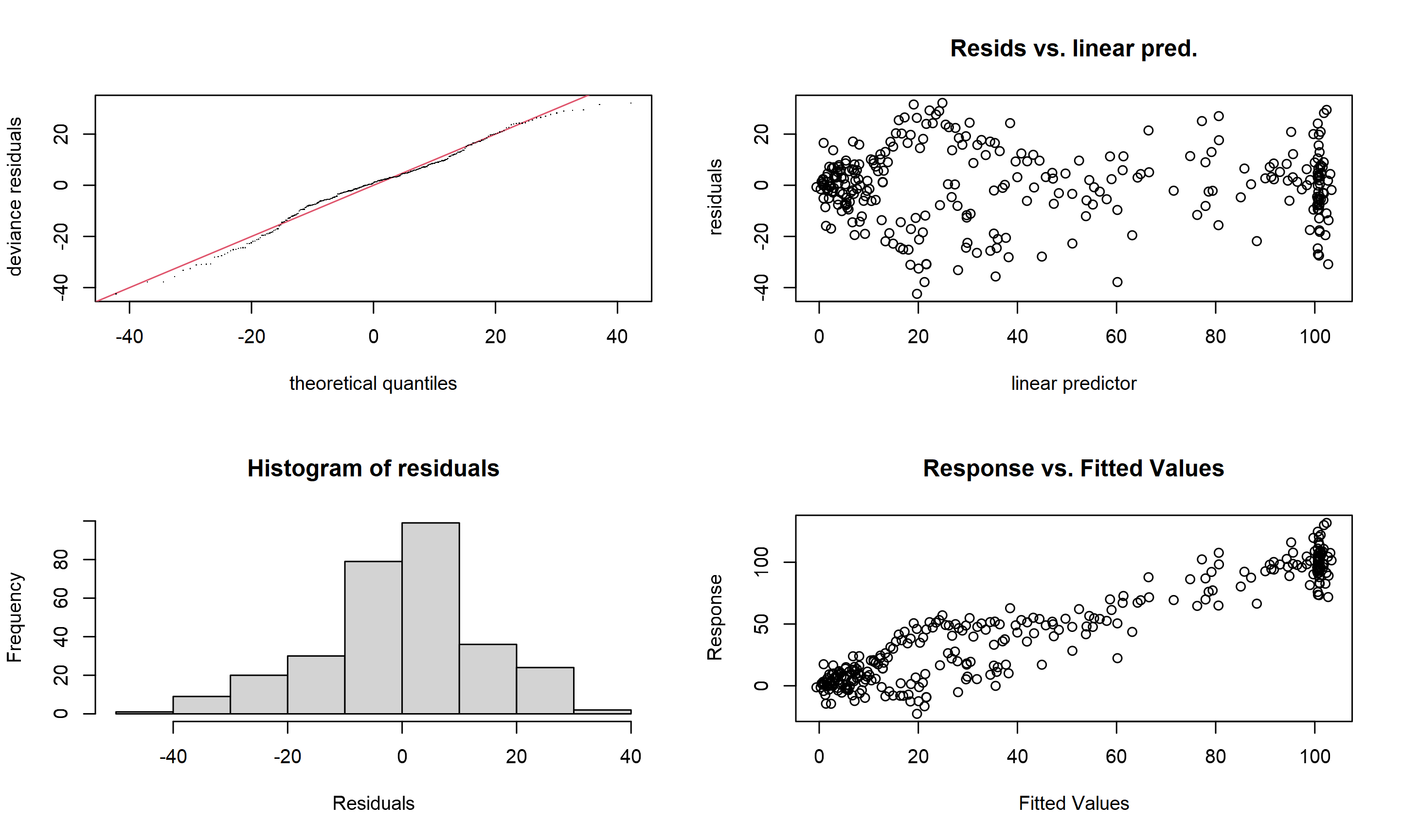
##
## Method: GCV   Optimizer: magic
## Smoothing parameter selection converged after 4 iterations.
## The RMS GCV score gradient at convergence was 1.107369e-05 .
## The Hessian was positive definite.
## Model rank =  10 / 10
##
## Basis dimension (k) checking results. Low p-value (k-index<1) may
## indicate that k is too low, especially if edf is close to k'.
##
##        k'  edf k-index p-value
## s(X) 9.00 6.09     1.1    0.97
10 Is it any better than linear model?
Lets test our model against a regular linear regression withe the same data:
my_lm <- lm(Y ~ X, data=dt)

anova(my_lm, my_gam)
## Analysis of Variance Table
##
## Model 1: Y ~ X
## Model 2: Y ~ s(X, bs = "cr")
## Res.Df RSS Df Sum of Sq F Pr(>F)
## 1 298.00 88154
## 2 292.91 60613 5.0873 27540 26.161 < 2.2e-16 ***
## ---
## Signif. codes: 0 '***' 0.001 '**' 0.01 '*' 0.05 '.' 0.1 ' ' 1Yes, yes it is! Our anova function has performed an f-test here, and our GAM model is significantly better that linear regression.
11 Summary
So, we looked at what a regression model is and how we are explaining one variable: \(y\), with another: \(x\). One of the underlying assumptions is a linear relationship, but this isn’t always the case. Where the relationship varies across the range of \(x\), we can use functions to alter this shape. A nice way to do it is by chaining smooth curves together at ‘knot’-points, and we refer to this as a ‘spline.’
We can use these splines in a regular regression, but if we use them in the context of a GAM, we estimate both the regression model and how smooth to make our smoothers.
The mgcv package is great for estimating GAMs and choosing the smoothing parameters. The example above shows a spline-based GAM giving a much better fit than a linear regression model. If your data are not linear, or noisy, a smoother might be appropriate
I highly recommend Noam Ross’ https://twitter.com/noamross?s=20 free online GAM course: https://noamross.github.io/gams-in-r-course/
For more depth, Simon Wood’s Generalized Additive Models is one of the best books on, not just GAMS, but regression in general: https://www.crcpress.com/Generalized-Additive-Models-An-Introduction-with-R-Second-Edition/Wood/p/book/9781498728331
12 References:
NELDER, J. A. & WEDDERBURN, R. W. M. 1972. Generalized Linear Models. Journal of the Royal Statistical Society. Series A (General), 135, 370-384.
HARRELL, F. E., JR. 2001. Regression Modeling Strategies, New York, Springer-Verlag New York.
HASTIE, T. & TIBSHIRANI, R. 1986. Generalized Additive Models. Statistical Science, 1, 297-310. 291
HASTIE, T., TIBSHIRANI, R. & FRIEDMAN, J. 2009. The Elements of Statistical Learning : Data Mining, Inference, and Prediction, New York, NETHERLANDS, Springer.
WOOD, S. N. 2017. Generalized Additive Models: An Introduction with R, Second Edition, Florida, USA, CRC Press.
Chris Mainey
Deputy Director of Specialist Analytics
NHS Data Scientist and analytical leader with interests in statistical modelling and machine learning in healthcare data.